MOPA
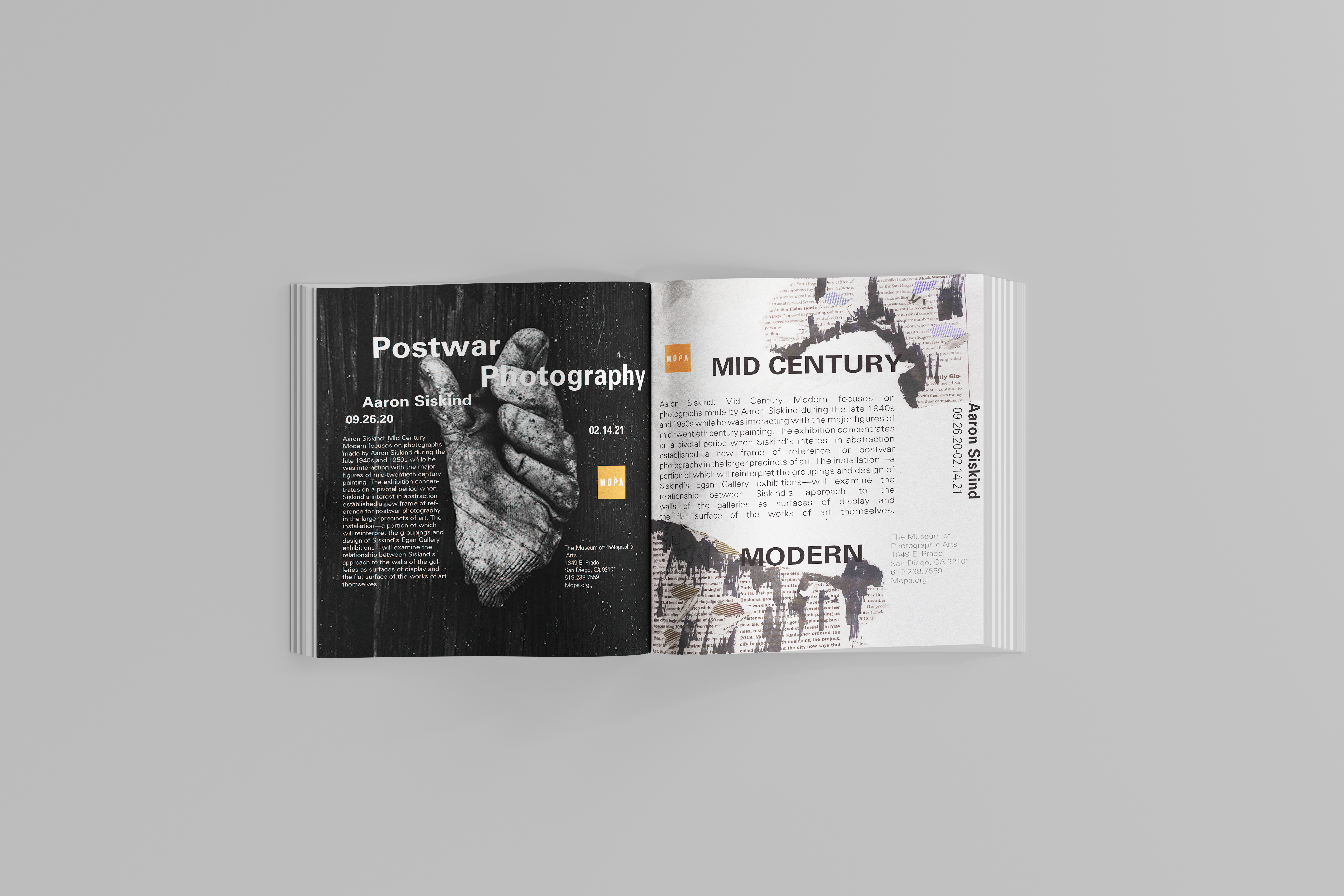
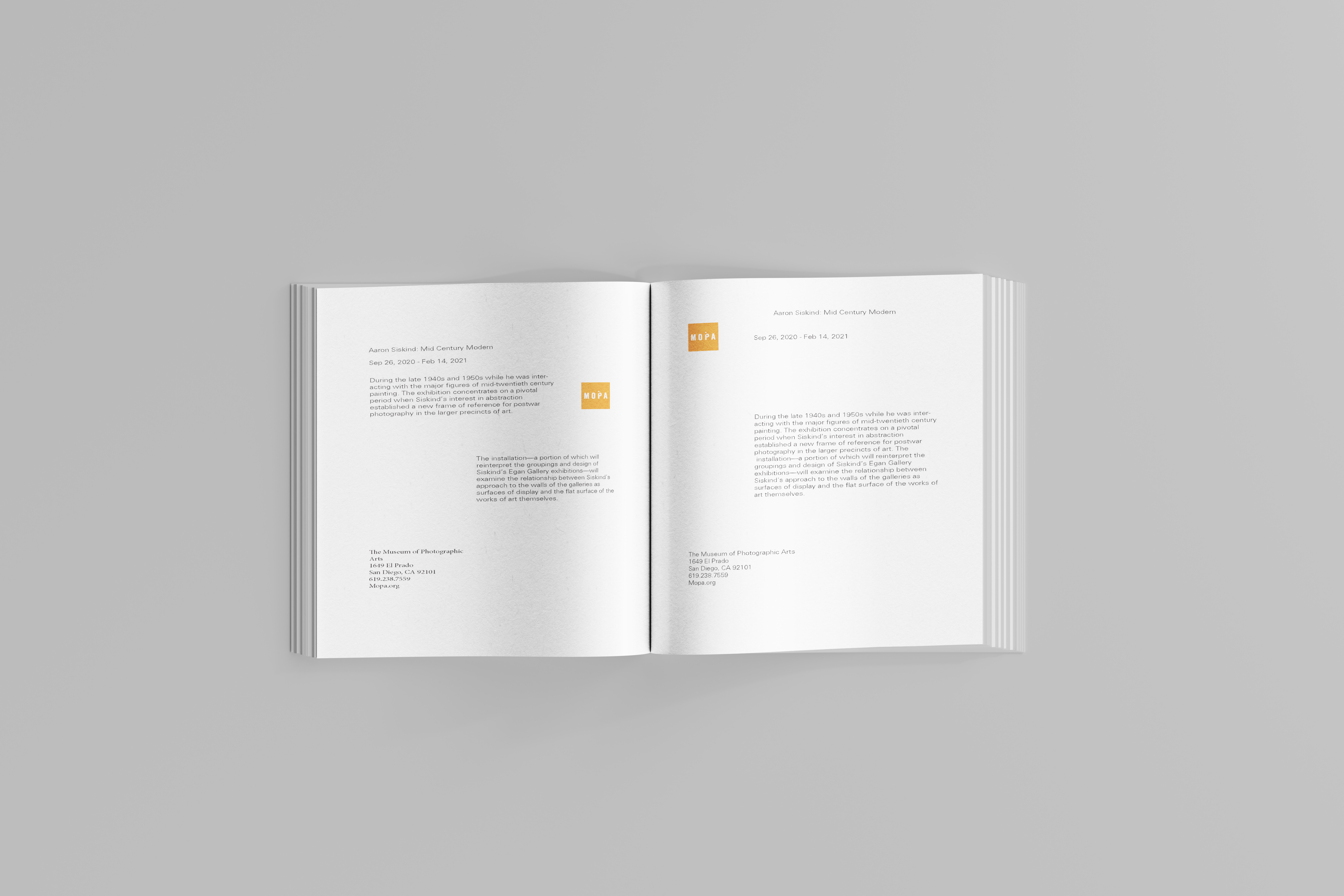
The final outcome of this project turned out to be significantly different from its initial concept. This project, completed for my typography class, was developed as an invitation for the Aaron Siskind exhibition at the Museum of Photographic Arts (MOPA) in San Diego. The core objective was to create an invitation that would effectively represent the exhibition while incorporating typography and design principles.
Click for closer look 👁
First Phase
Click for closer look 👁
Second Phase

Click for closer look 👁
Third Phase
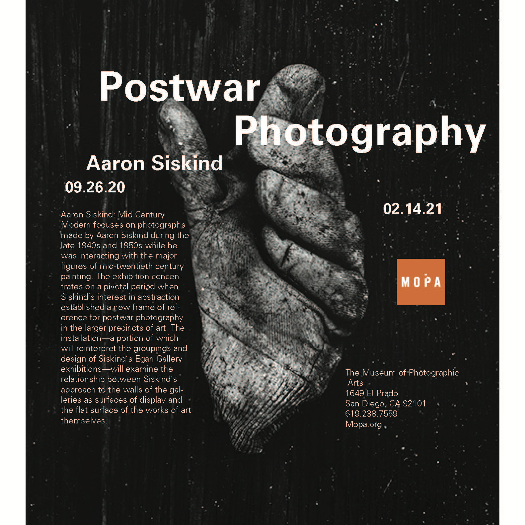
As I progressed, my confidence grew while experimenting with different arrangements and manipulating parts of the text. This phase became one of my favorites, as I not only rotated the text to achieve a comic book-inspired style, but I also explored variations in font size and weight, adding a dynamic and engaging element to the design.

Click for closer look 👁
Final Posters
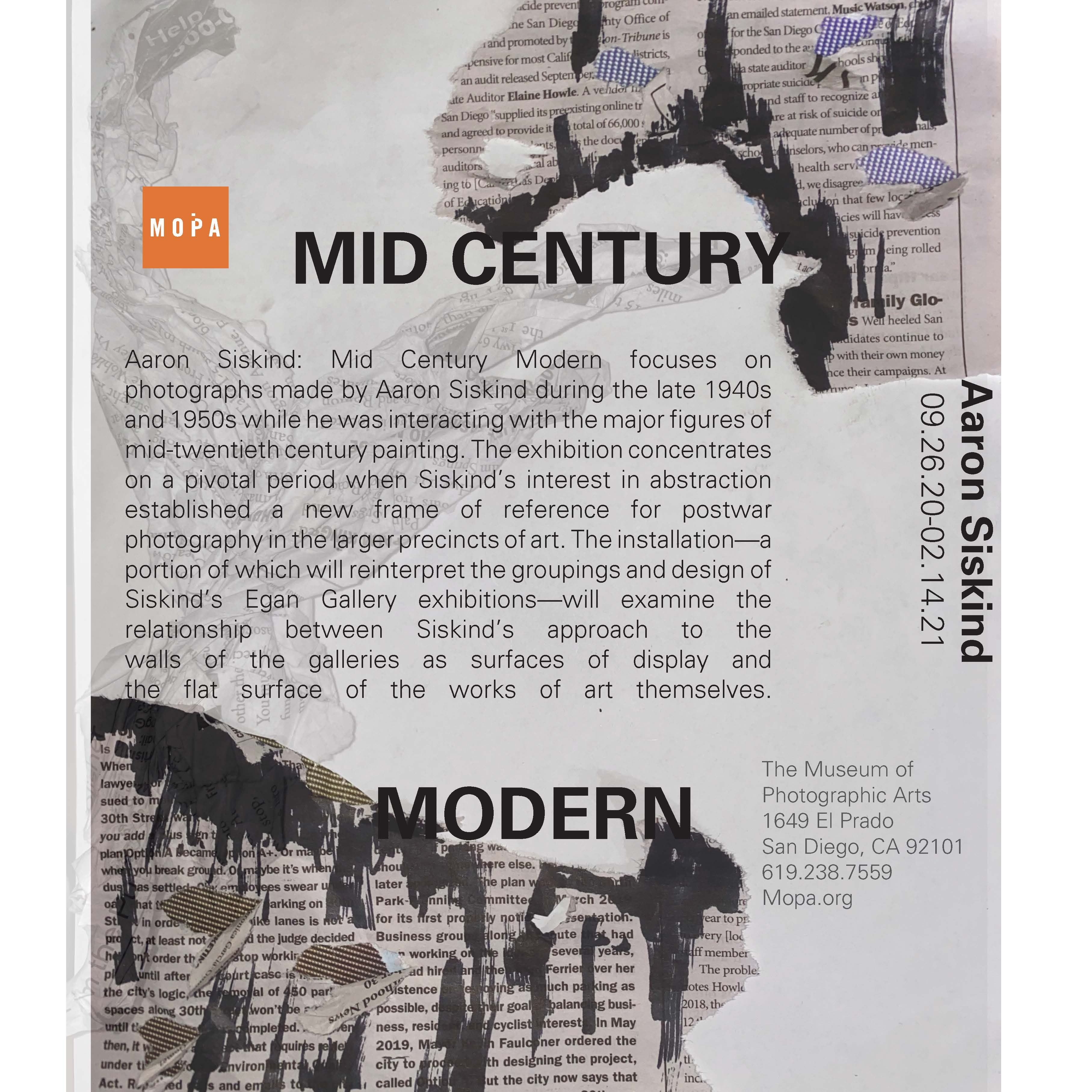
The final section of the project was the most experimental, as it involved hands-on techniques such as cutting and folding pieces of newspaper. I also began to develop additional ideas for this section, such as applying ink to the torn edges of the newspaper and allowing the text to flow from these areas. This phase provided an opportunity for me to further experiment with InDesign, resulting in a successful and visually compelling outcome.
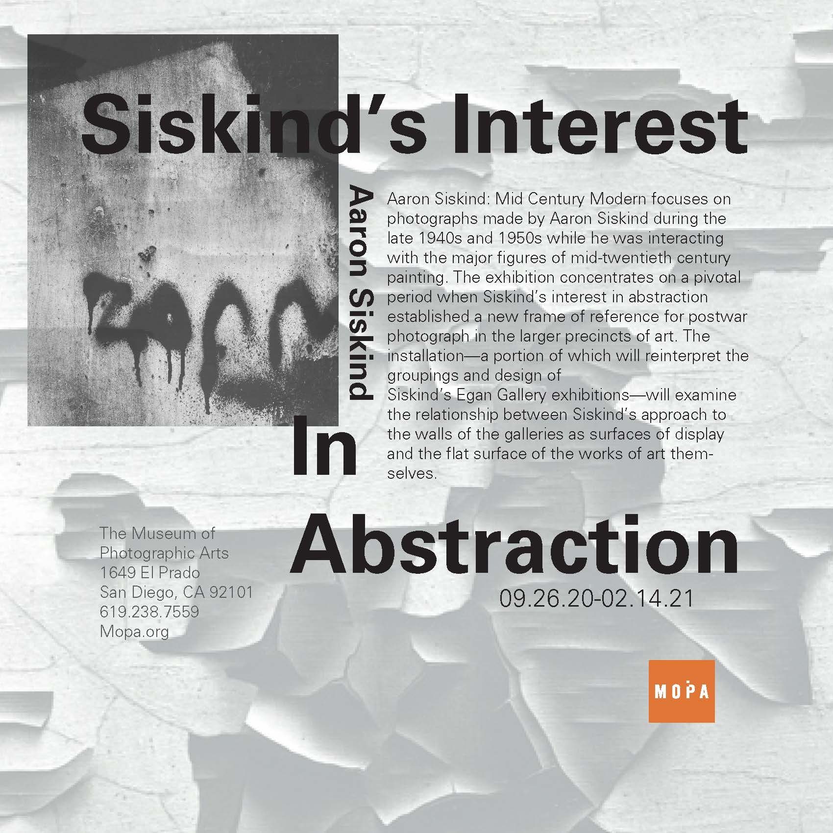
Click for closer look 👁