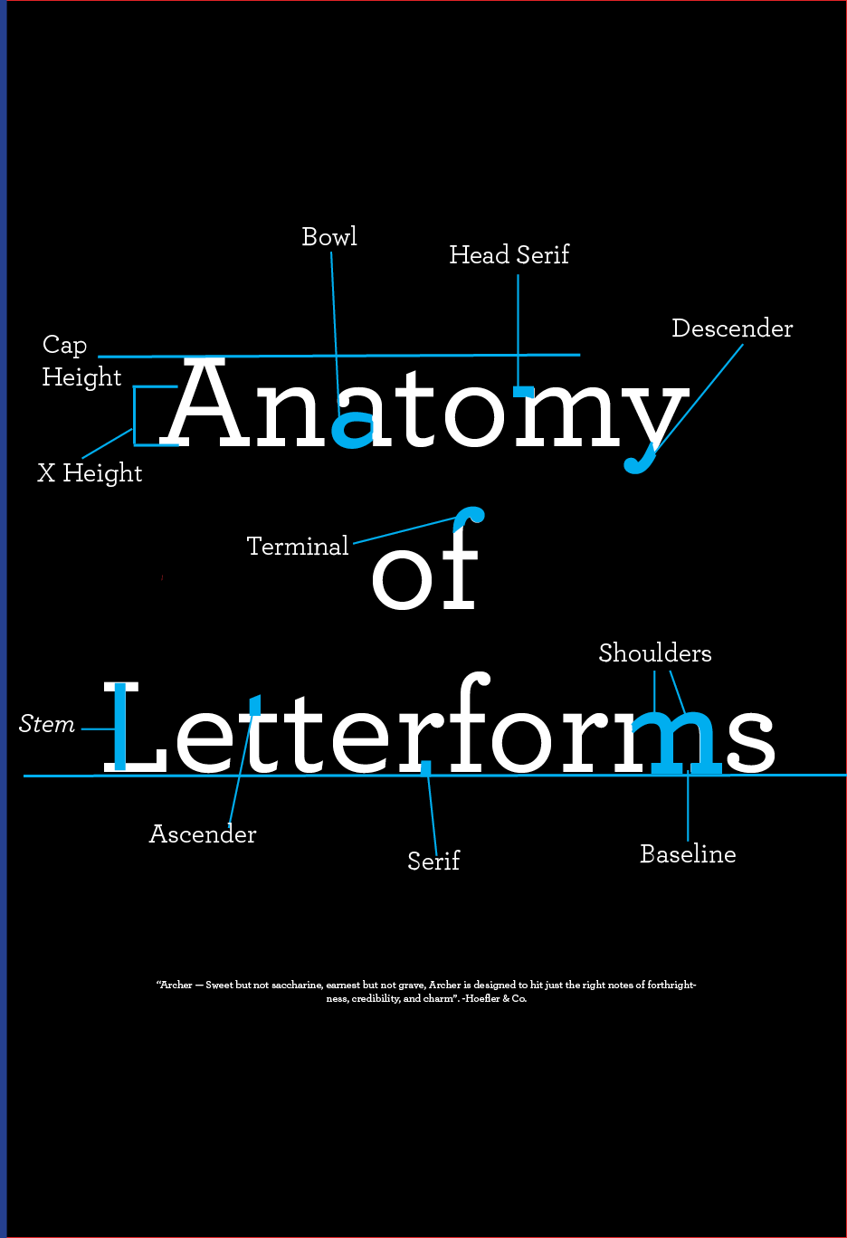
Archer Anatomy
Click for closer look 👁
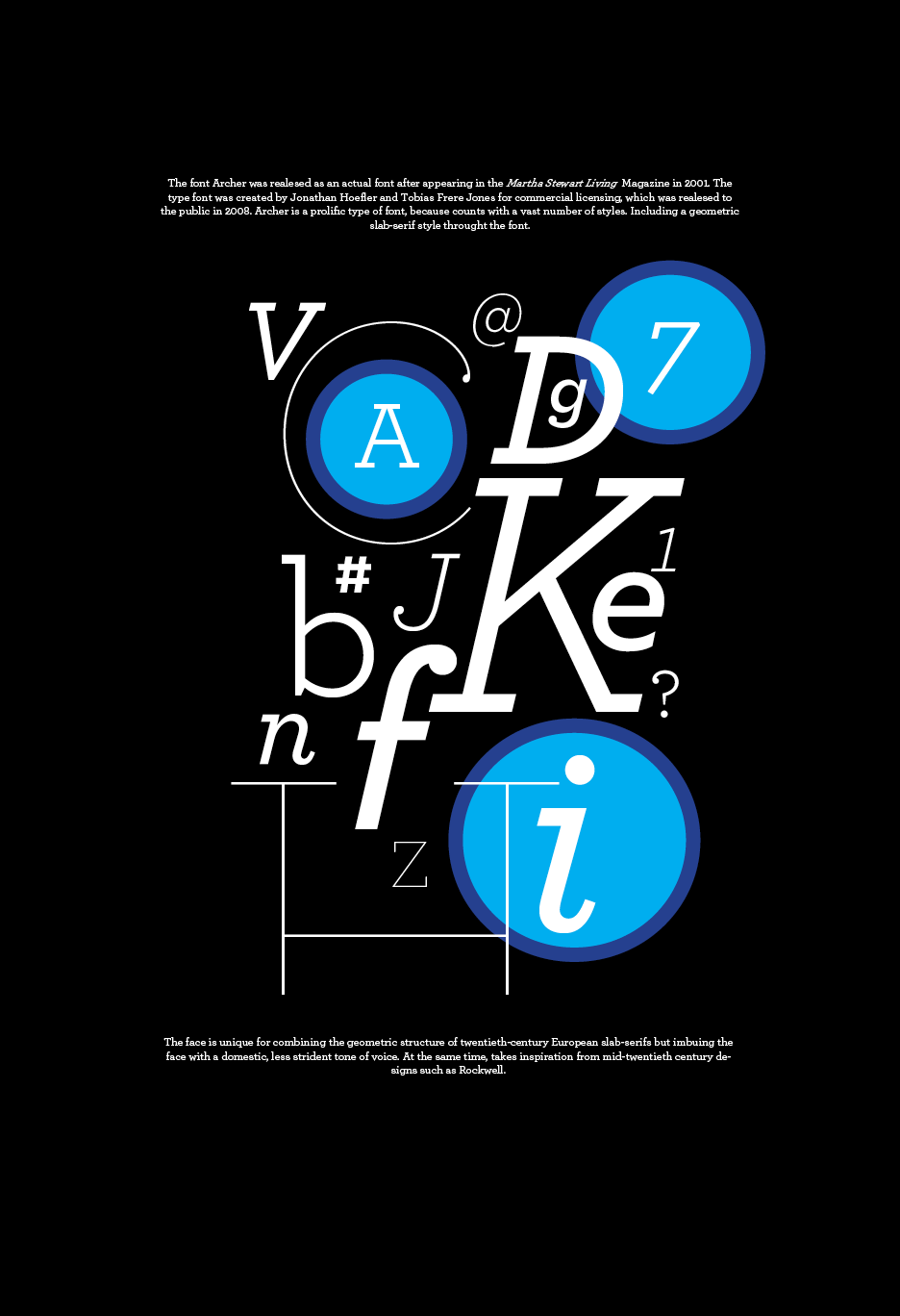
For this project in my typography class, the initial phase of brainstorming and generating ideas for explorations was relatively straightforward. However, the process of crafting and finalizing a letterform based on geometric and design principles—ultimately named Archer—proved to be a challenging and thoughtful endeavor. The development of this font required careful consideration, but the final result exceeded my expectations.
Through this process, I learned to deconstruct individual letterforms and utilize elements of these letters to construct the type specimen study for the font. Additionally, the project allowed me to experiment with color and playfulness, which added a layer of interest and creativity to the design, making the experience even more enjoyable and engaging.
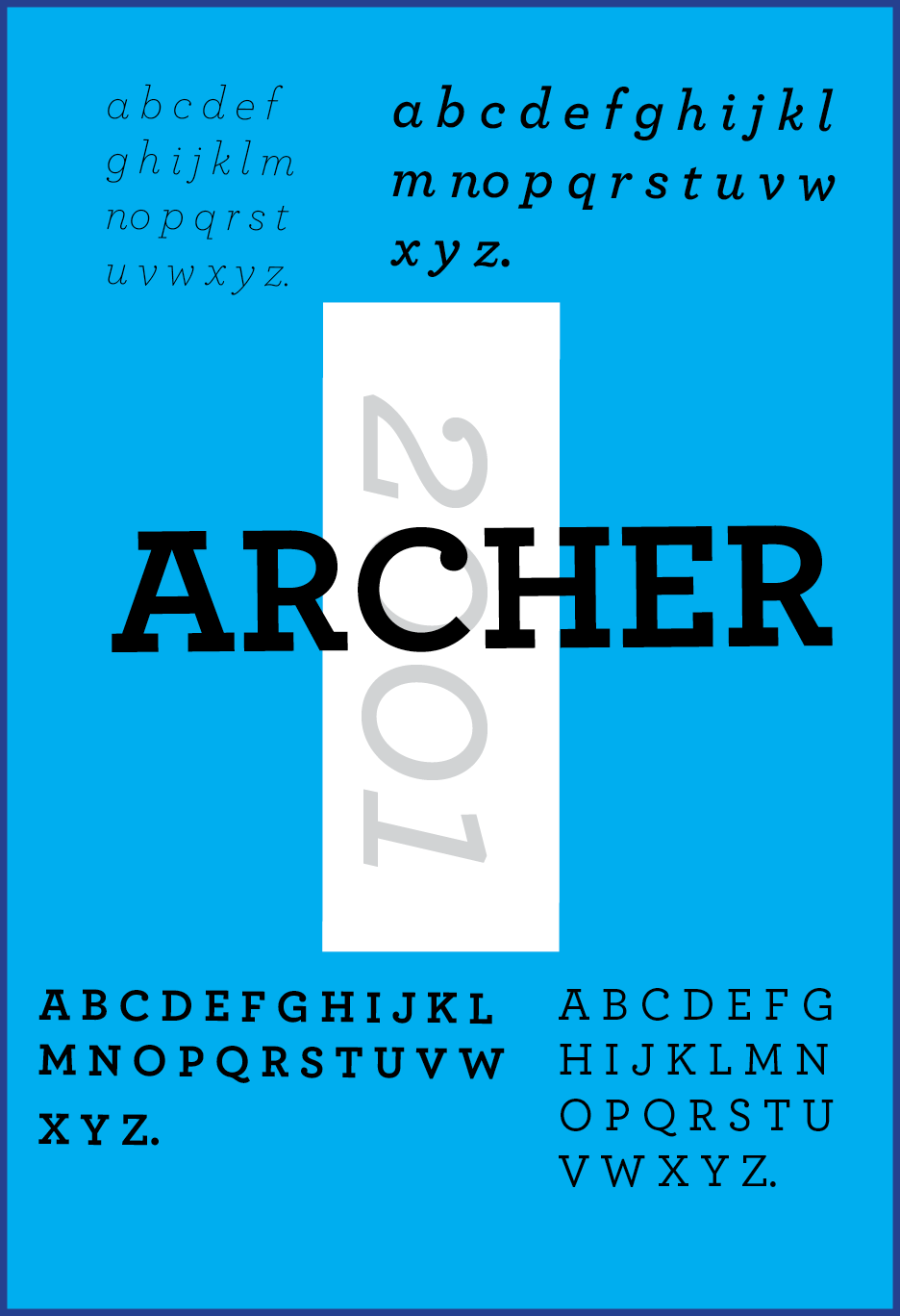
Explorations with Color

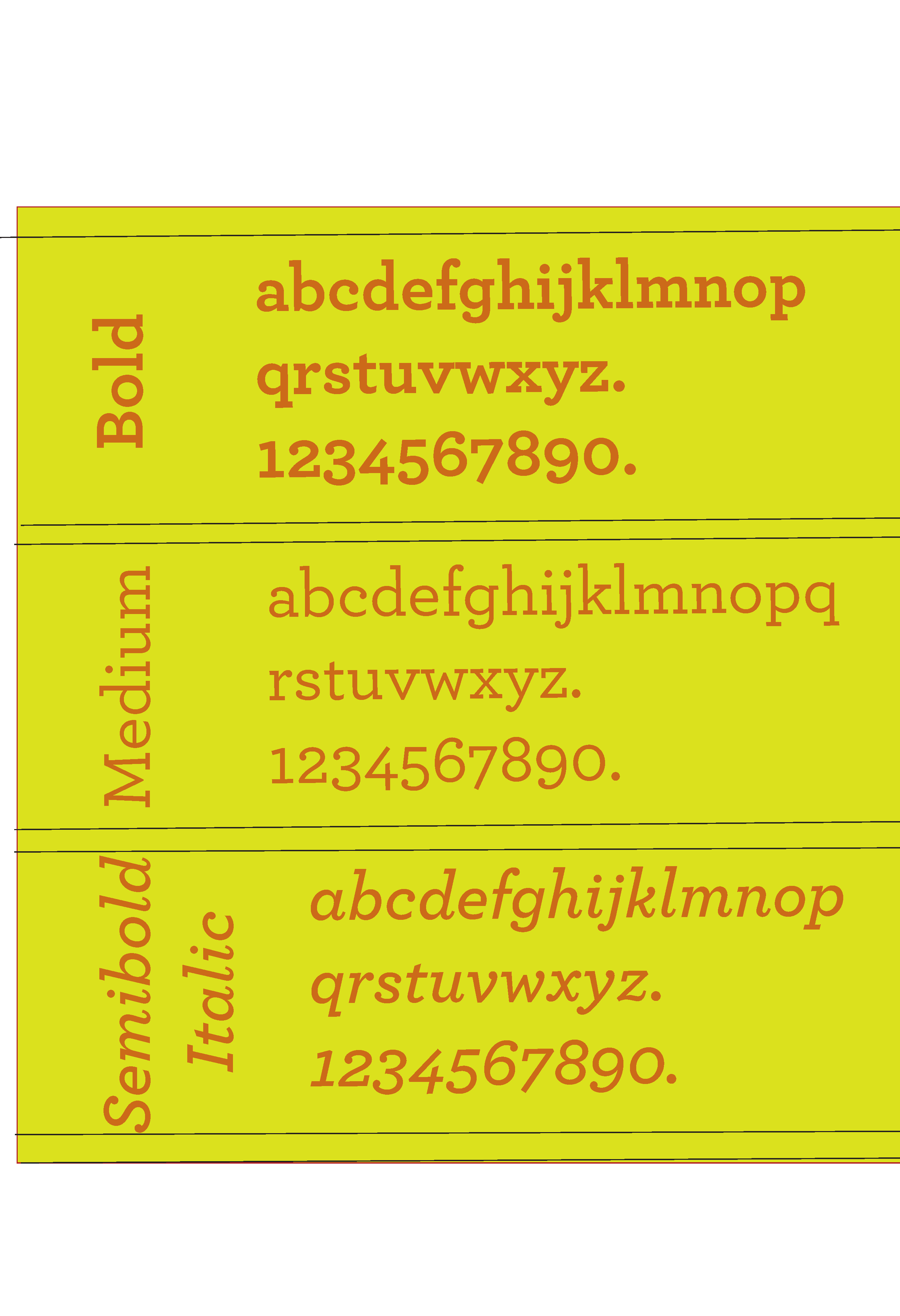


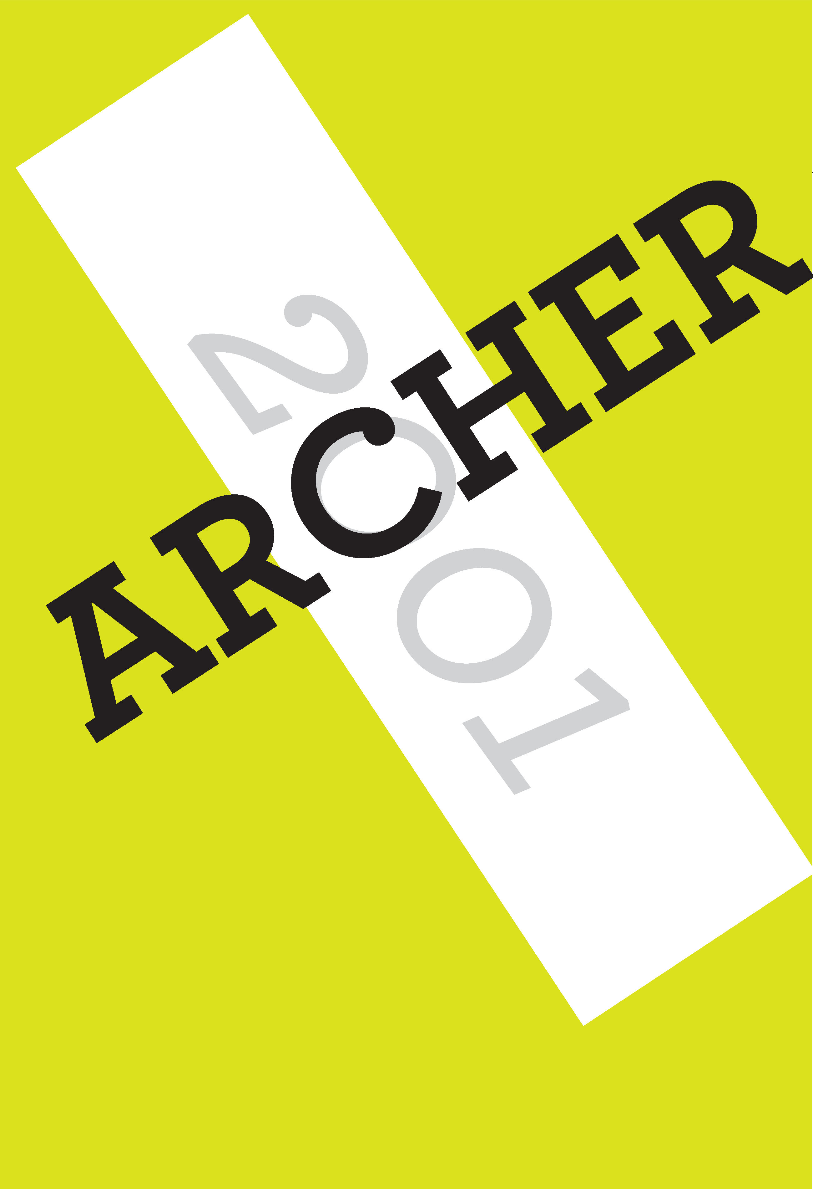
Click for closer look 👁
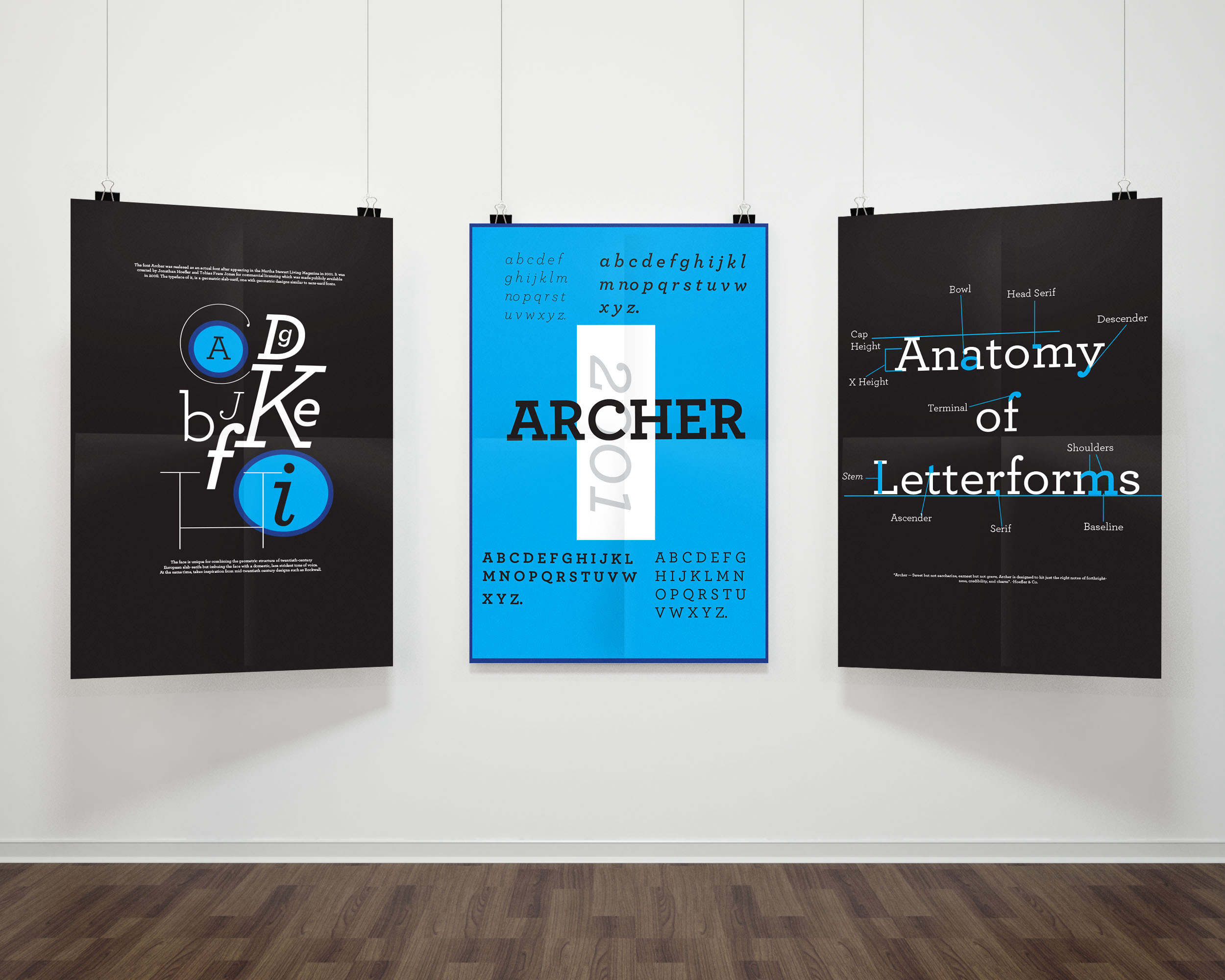
Final 3 Selected for the Project
Click for closer look 👁